Edvantage Institute Australia – Full Rebrand & Rollout
Key stakeholders
Worked directly with GBCA’s CEO and the Melbourne management team, in consultation with the board of owners in China, to lead the creative redevelopment of their new higher education brand, Edvantage Institute Australia (EIA).
Brief
After two unsuccessful agency attempts, GBCA tasked me with creating a distinct, credible and future proof identity for EIA, one that would attract international students, align with regulatory expectations and visually connect to GBCA’s established reputation.
My role
As Art Director / Senior Designer, I provided end to end creative leadership, from brand strategy and concept development to presentations, client management and production oversight. I ensured brand consistency across all digital and physical applications, working closely with internal teams and suppliers to deliver a cohesive rollout.
Deliverables
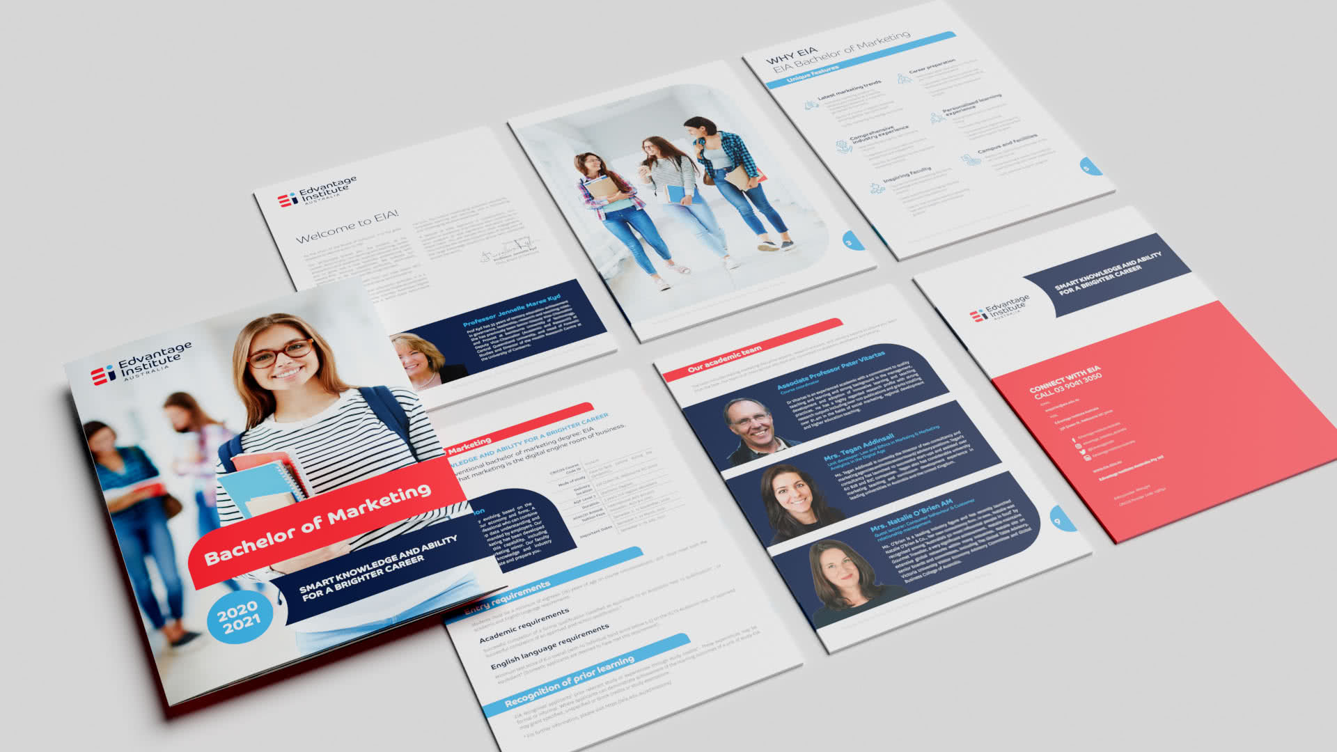
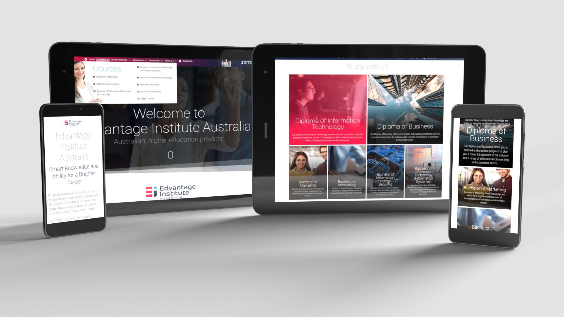
Visual identity system: logo, colour palette, typography, iconography | Brand guidelines and rollout strategy | Website design and UX structure | Marketing and recruitment collateral | Campus signage and environmental graphics
Results / Alignment with the brief
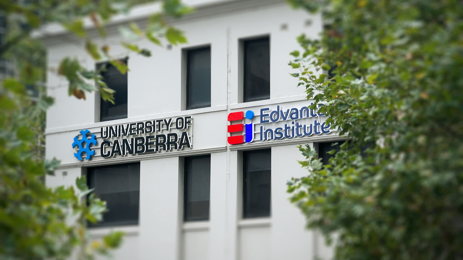
The new EIA brand delivered a clear, confident and contemporary identity that met the brief’s goals of credibility, differentiation and recruitment appeal. Its consistent rollout strengthened brand trust among international students and positioned EIA as a recognised higher education provider alongside GBCA. The identity has remained in continuous use for over seven years, validating its strategic and visual longevity.
Melbourne Sports Hub – Unified Brand System
Key stakeholders
Collaborated directly with the State Sport Centres Trust (SSCT) CEO and General Manager, the organisation overseeing MSAC, SNHC (now “Melbourne Sports Centres Parkville”), Lakeside Stadium, and the MSAC Institute of Training, to deliver a cohesive, cross venue brand transformation.
Brief
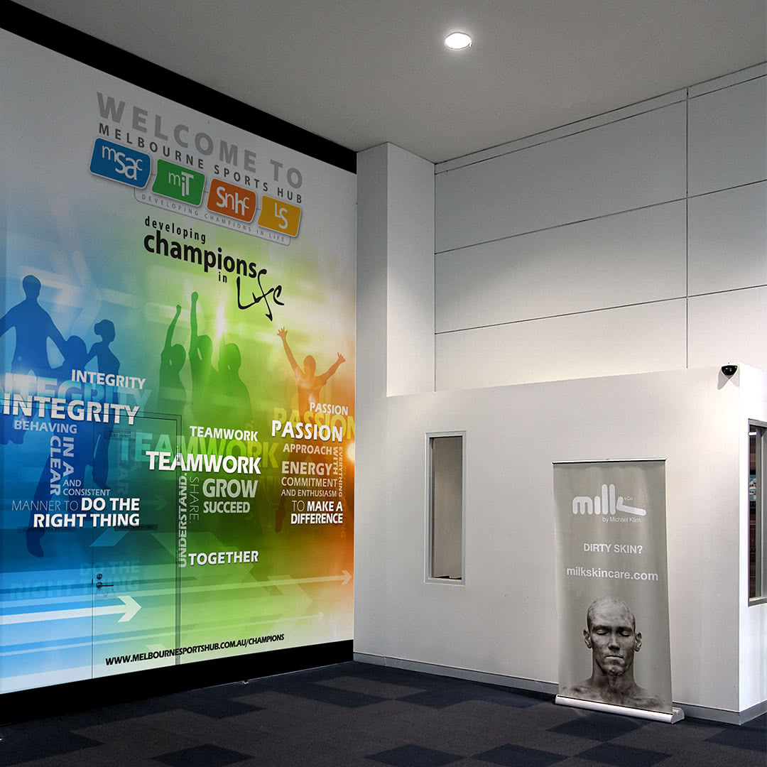
To create a functional, unified brand system connecting the four major SSCT facilities under one consistent identity. The goal was to enhance visual recognition, unify visitor communication and modernise the venues’ presentation across all physical and digital channels.
My role
As exclusive design contractor to SSCT, I led the brand architecture and visual identity development, managed key stakeholder approvals and coordinated rollout across multiple sites. I worked closely with venue teams and external suppliers to ensure creative consistency and operational practicality throughout implementation.
Deliverables
Unified brand architecture and visual identity system | Full environmental and wayfinding design (banners, wall art, counters, kiosks, signage) | Comprehensive marketing suite: flyers, posters, brochures, event banners and digital advertising assets | Website and social-media graphics for event promotion and membership campaigns | On-site information panels, venue maps, and branded touchpoints across all locations
Results / Alignment with the brief
The rebrand achieved a cohesive, recognisable visual identity across all SSCT venues, directly meeting the brief’s goal of unity and clarity. Improved wayfinding, visual consistency and digital cohesion contributed to stronger public recognition and an uplift in community engagement and venue attendance
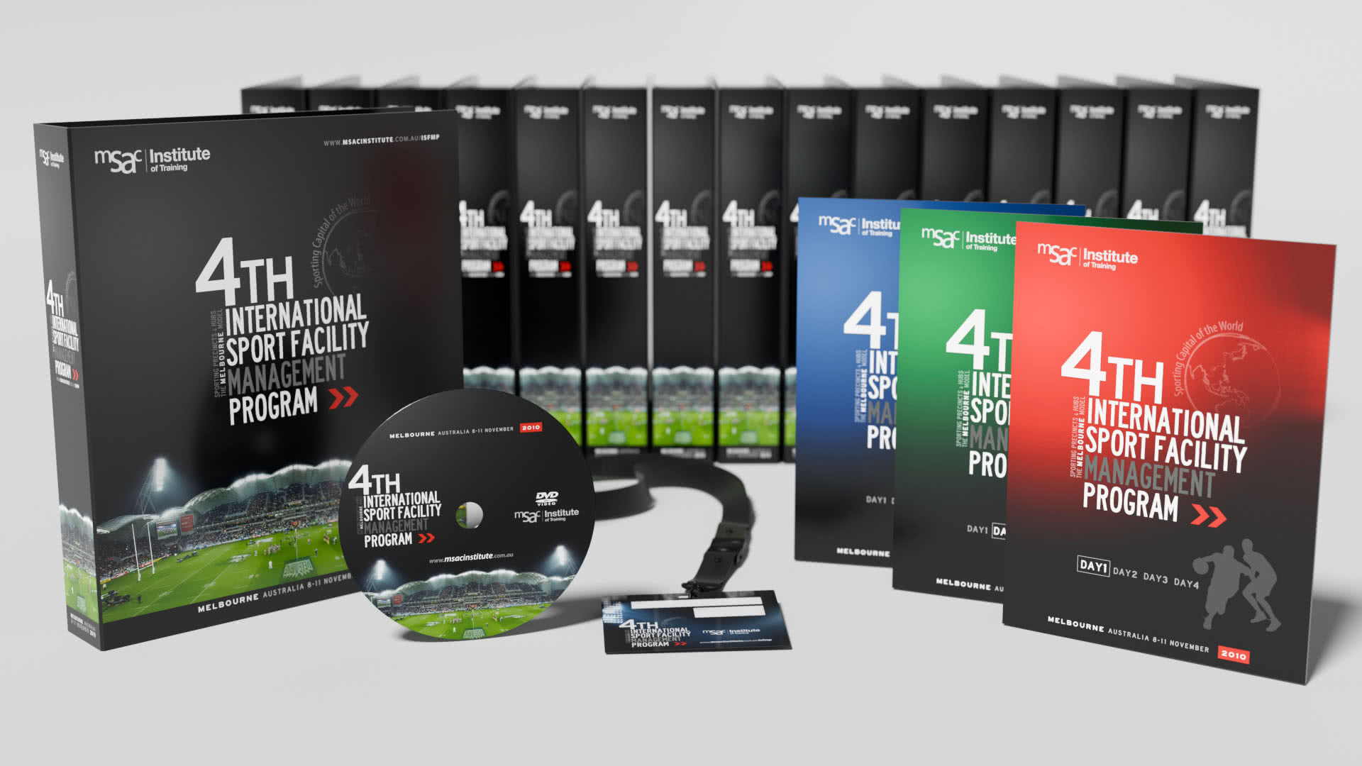
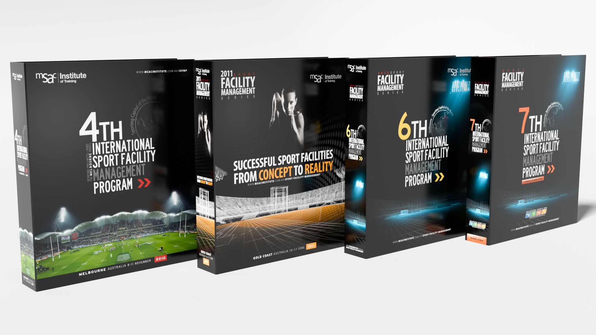
International Sport Facility Management Program
– Sub Brand and Event Toolkit
Key stakeholders
Worked with the State Sport Centres Trust (SSCT) CEO and General Manager, the statutory authority operating MSAC, SNHC/Parkville, and Lakeside Stadium, and the RTO trading as MSAC Institute of Training.
Brief
Design a distinct sub brand and event toolkit for the MSAC Institute of Training’s flagship International Sport Facility Management Program (ISFMP), an executive program delivered in Melbourne and featuring workshops and venue tours.
My role
As exclusive design contractor to SSCT, I led the creative direction end to end: developed the sub brand, managed stakeholders (CEO/GM), presented concepts and iterations and directed production to ensure consistent execution across print, digital and on site assets.
Deliverables
Sub brand identity (logo, palette, typography, icon set) | Event system: banners, information panels, wayfinding graphics | Marketing suite: flyers, brochures, posters, digital assets (web/social, email headers) | Program binders with inner-page templates, lanyards, name tags, business cards, certificates
Results / Alignment with the brief
The toolkit delivered a clear, professional identity for ISFMP that visually distinguishes the program while staying aligned with SSCT/MSAC’s brand ecosystem. It supported the program’s executive positioning and Melbourne venue tour format documented publicly (workshop/tour model and target audience), directly matching the brief for distinction + cohesion.
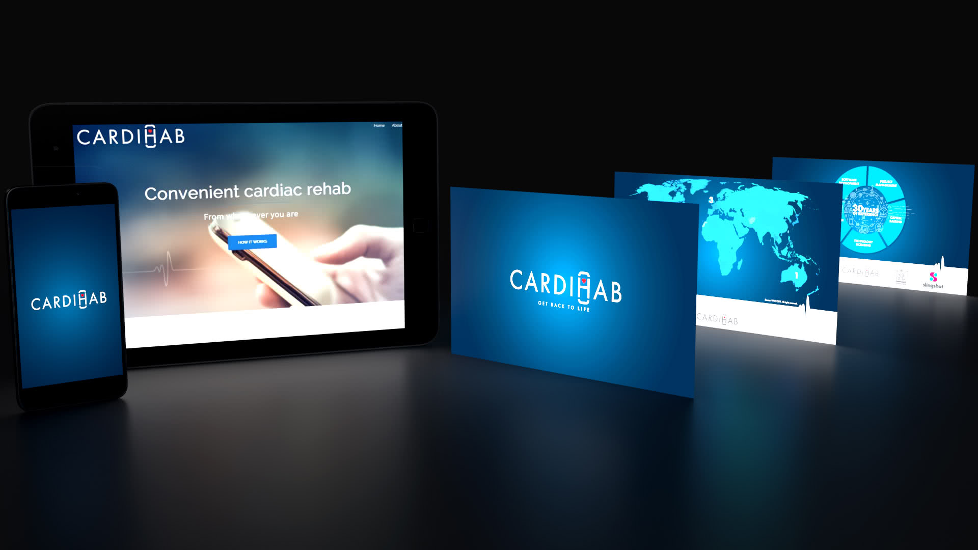
CARDIHAB – Brand Identity & Launch Toolkit
Key stakeholders
Worked directly with the founding leadership of Cardihab, a spin out from CSIRO’s AEHRC and backed by venture partners, to build a strong visual brand at company inception.
Brief
Create a distinct, impactful brand identity and lean launch toolkit under a tight budget and timeline to support Cardihab’s positioning as Australia’s first clinically proven digital therapeutic for cardiac rehabilitation.
My role
As the exclusive design contractor, I developed the full visual brand identity and created the launch presentation deck. The founders took charge of messaging tone, stakeholder presentations and production oversight.
Deliverables
Visual identity system (logo, colour palette, typography, iconography) | Opening presentation deck for launch and investor engagement | Supporting print and digital assets: pull-up banners, flyers, social graphics
Results / Alignment with the brief
The identity and launch deck delivered a clear, professional brand presence that supported Cardihab’s clinical credibility and spin out narrative. This work laid the visual foundation for investor discussions, clinical partnerships and market entry, even though brand specific metrics are kept internal.
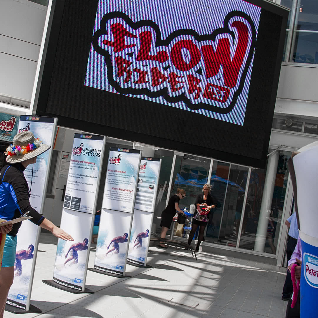
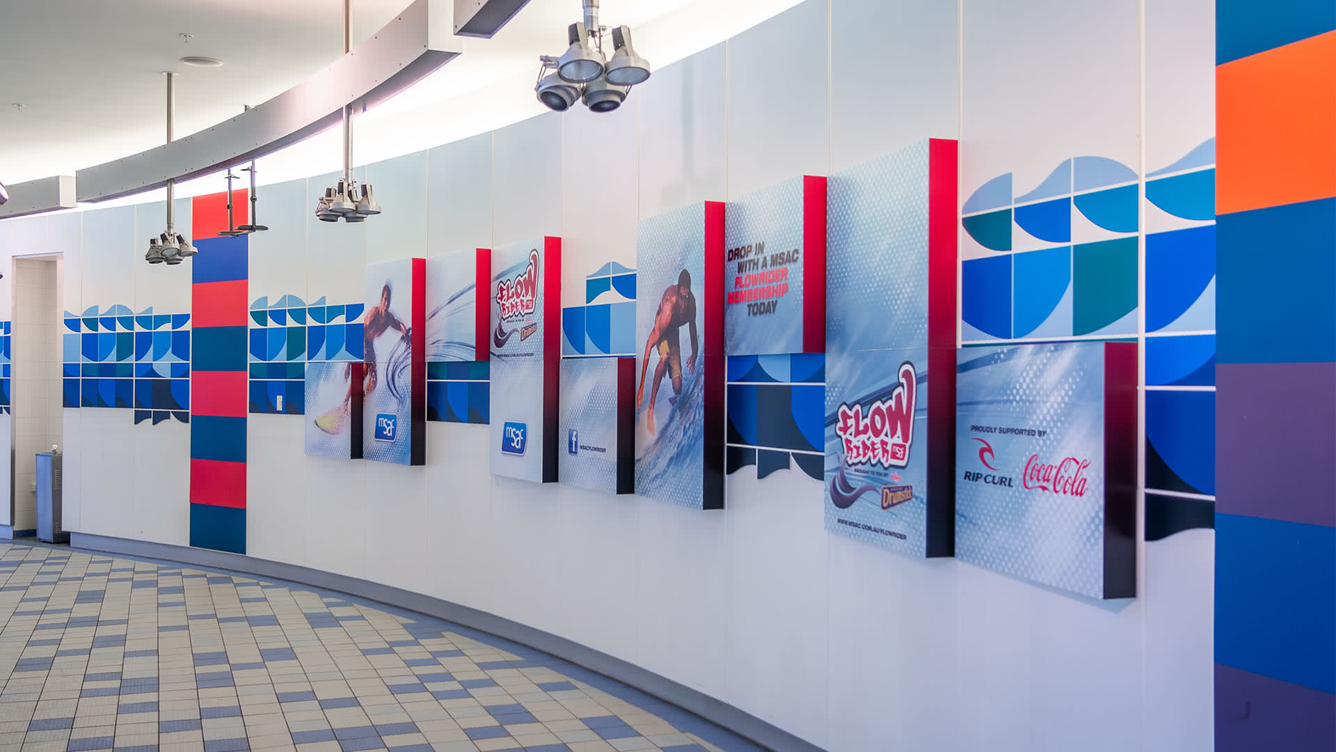
FlowRider – Attraction Branding
Key stakeholders
Worked with the State Sport Centres Trust (SSCT) leadership (CEO & GM) and the MSAC management team to brand MSAC’s new FlowRider attraction, part of the Trust’s Melbourne venue network.
Brief
Create a fresh, youth oriented sub brand for FlowRider at MSAC, capturing surf energy while fitting the MSAC/SSCT ecosystem. The attraction launched at MSAC as Victoria’s first “FlowRider Double” (2011–2012).
My role
As exclusive design contractor to SSCT, I led creative direction, concept development, stakeholder presentations and production oversight to deliver a cohesive identity and launch toolkit across on site and digital channels.
Deliverables
Full visual identity (logo, palette, typography, graphic language) | Opening event materials: banners, information panels, environmental graphics | Marketing suite: flyers, posters, web & social assets; partner/co-brand logo variations | Launch campaign templates and digital promotional toolkit
Results / Alignment with the brief
The identity system delivered the dynamic, surf led logo required by the brief while remaining cohesive with MSAC/SSCT branding, supporting launch visibility for the MSAC FlowRider Double and helping position the attraction as a signature experience within the centre.
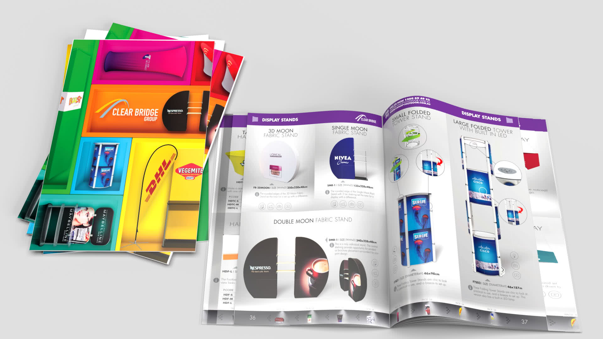
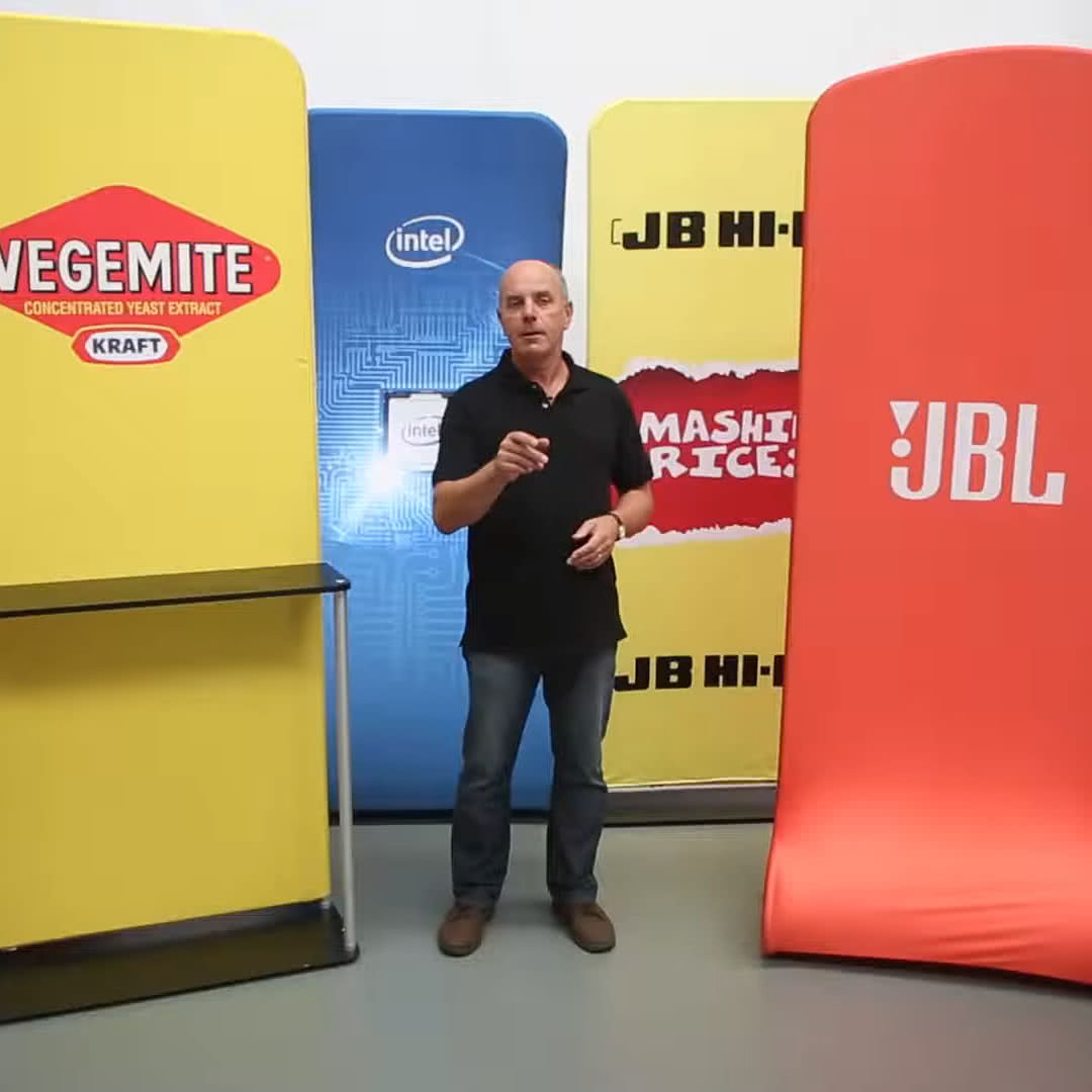
ExpoSupplies – Brand Identity & Product Launch
Key stakeholders
Worked directly with the Clear Bridge Group leadership (parent company of Exposupplies) to create and launch a distinct sub brand focused on exhibition and display products.
Brief
Develop a unique, impactful brand identity for a new Clear Bridge business line, Exposupplies and prepare it for market with a cohesive set of sales and marketing tools.
My role
As Art Director / Senior Designer, I created the Exposupplies brand and led content development. For the branded product films, I wrote, filmed, directed and edited the pieces and liaised with agencies to recruit extras and manage production logistics.
Deliverables
Complete identity system: logo, colour, typography, graphic language | Branded product videos (concept, shoot, edit) | Product catalogues and price collateral | Full marketing suite (print and digital) | Website design/content supporting launch
Results / Alignment with the brief
The new brand identity, website and product videos positioned Exposupplies as a credible, independent brand within the Clear Bridge portfolio. The cohesive rollout, spanning print, digital and social media, significantly strengthened market visibility and customer engagement, contributing to notable growth in interest and sales across the parent company’s product lines.